

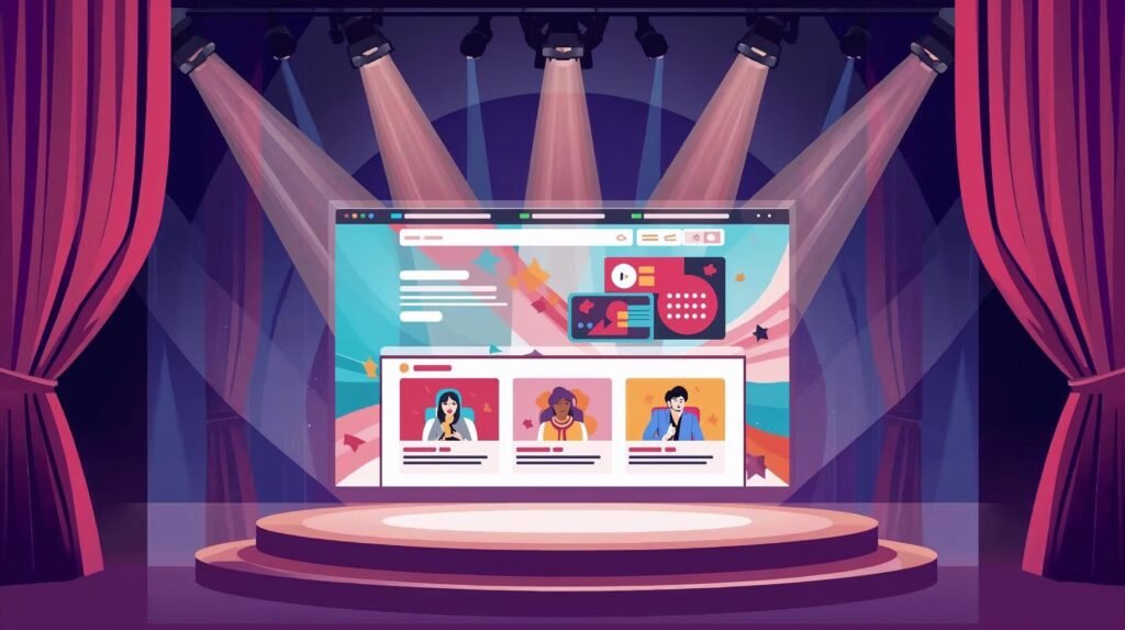
For many speakers, the first stage they stand on… is not a stage at all. It’s a screen.
Before a bureau books you, before an event planner emails you, before an attendee hears your voice—your website speaks for you. The question is: does it perform?
Too many speaker websites function like digital brochures: static, information-heavy, and visually generic. But your website should do what you do on stage:
✅ Capture attention
✅ Create connection
✅ Inspire action
A speaker’s website isn’t a résumé—it’s a demo of the experience you deliver.
Here’s how to turn your site into a stage where influence begins.
🎯 The Goal of a Speaker Website: Sell the Transformation
Event planners don’t book speakers.
They book outcomes.
Your website must answer these questions instantly:
- Who are you here to help?
- What change do you create?
- Why should we trust you with our audience?
Lead with the promise, not the bio.
People care less about what you’ve done and more about what you’ll help their people do.
🌟 Emotional Storytelling Builds Preference
Your unique brand story must be visible—not buried in a “About” tab. The way you transform an audience should appear in:
- Copy that sounds like your voice
- Visuals that reflect your vibe and energy
- Stories that reveal your why
- Testimonials that describe the after, not the before
Decision-makers often make intuitive choices, then justify them logically.
Emotion opens the door. Data confirms the booking.
🧩 UX Design = The User’s Journey to Yes
User experience (UX) is your choreography online. Each click should feel like momentum toward booking you.
A high-performing speaker website includes:
| Section | Purpose |
| Hero section with clear value proposition | Instant clarity |
| Demo video | Proof you can command a room |
| Speaking topics | Market-ready positioning |
| Social proof | Peer validation builds trust |
| CTA buttons throughout | Frequent booking invitations |
| Event planner resources | Make saying yes easy |
| Contact + inquiry form | Remove friction |
If clicking around your website feels like work, your visitor leaves.
📽️ Your Demo Video: The Standing Ovation Moment
Your video is not optional—it is the #1 conversion asset on the site.
In 90–180 seconds, planners must see:
- Your presence
- Your delivery style
- Your understanding of audiences
- Your strongest moments condensed
Think of it as a movie trailer:
They should finish wanting the full experience.
🧠 Cognitive Load: Why Simplicity Sells
Web visitors skim, scroll, and select within seconds. Too much text = overwhelmed users.
Simplify so they can:
- Find what matters
- Feel what’s meaningful
- Act without hesitation
White space isn’t emptiness—it’s clarity.
Your content should land like your keynote:
focused, paced, intentional.
✅ Trust Signals = Confidence in Hiring
Event planners take risks when hiring. Reduce perceived risk by showcasing:
- High-quality branding (design = credibility)
- Client logos (social identity trust)
- Data from past results
- Press mentions
- Video testimonials
Trust removes doubt.
Doubt kills deals.
🖥️ Treat Navigation Like Stage Blocking
Guide visitors deliberately:
- Primary CTA: Book Me / Check Availability
- Secondary CTA: Watch Demo / Download One-Sheet
- Highlight most important links above the fold
Every scroll and click should feel like:
“Yes, this is the speaker we need.”
🌍 Design for All Audiences
Accessibility is not just compliance—it’s inclusion.
Consider:
- Captions on all video
- Alt-text for images
- High contrast for readability
- Mobile-first layout (most traffic will be on phones)
Accessibility communicates respect for your entire audience—before they ever see you live.
🔁 Update Often—You Are a Living Brand
A speaker who evolves but never updates their site creates mismatch and mistrust.
Update regularly:
- New video highlights
- New case studies
- New topics or positioning
- Speaking calendar or recent events
A current site signals a current voice.
💡 Turning Great UX into More Bookings
A speaker website should:
- Attract visitors with clarity and aesthetic
- Engage them with story and video
- Persuade them with proof and relevance
- Convert them with frictionless CTAs
Done right, it becomes:
- Your best sales rep
- Your most reliable referral tool
- Your most scalable stage
While you’re asleep, it’s booking your next event.
Final Thought
Your website shouldn’t describe your impact.
It should demonstrate it.
You’re not just showing what you do—
You’re giving a preview of how you’ll change the room.
When your online presence delivers emotional resonance and professional confidence, event planners won’t just be interested…
they’ll already be imagining you on their stage.
And that’s when the booking becomes inevitable.
Sources
- https://pmc.ncbi.nlm.nih.gov/articles/PMC3824747/
- https://pmc.ncbi.nlm.nih.gov/articles/PMC3986888/
- https://pmc.ncbi.nlm.nih.gov/articles/PMC4246028/
- https://pmc.ncbi.nlm.nih.gov/articles/PMC8611531/
- https://www.sciencedirect.com/science/article/pii/S1877042815011400
- https://www.sciencedirect.com/science/article/pii/S0742051X21000735